足元に宿る「侘び寂び」の表現 vol.2|SHAPE OF WABI-SABI
2026.04.23
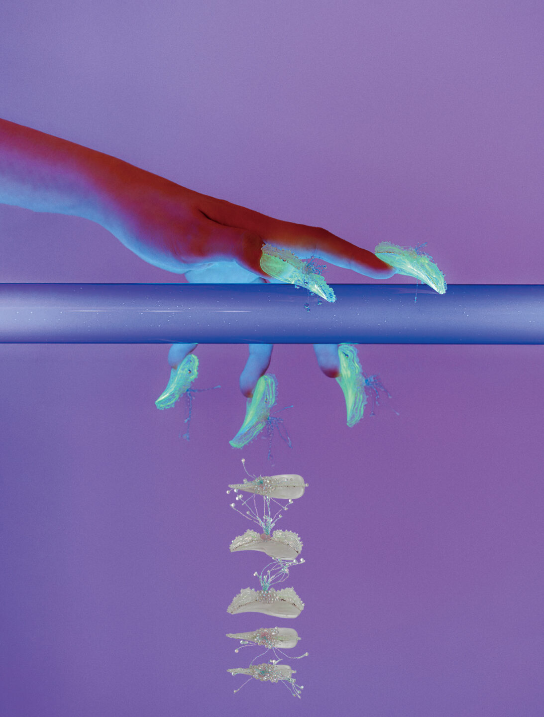
儚さを、未完成さを、「美しい」と思う心を私たちは確かに持っている。10名のネイリストが、日本古来の美意識をフットの世界に投影。それぞれの感性と響き合いながら、静かな存在感を放つアートに注目。WEBページでは、作品に込めた想いや、フットネイルならではの視点についてインタビュー。
We undeniably possess a sensibility that finds beauty in transience and imperfection. Ten nail artists interpret traditional Japanese aesthetics through the world of foot design. Resonating with each of their individual sensibilities, the resulting artworks command a quiet yet striking presence. On this page, we feature an interview exploring the thoughts behind the work, as well as perspectives unique to foot nail design.
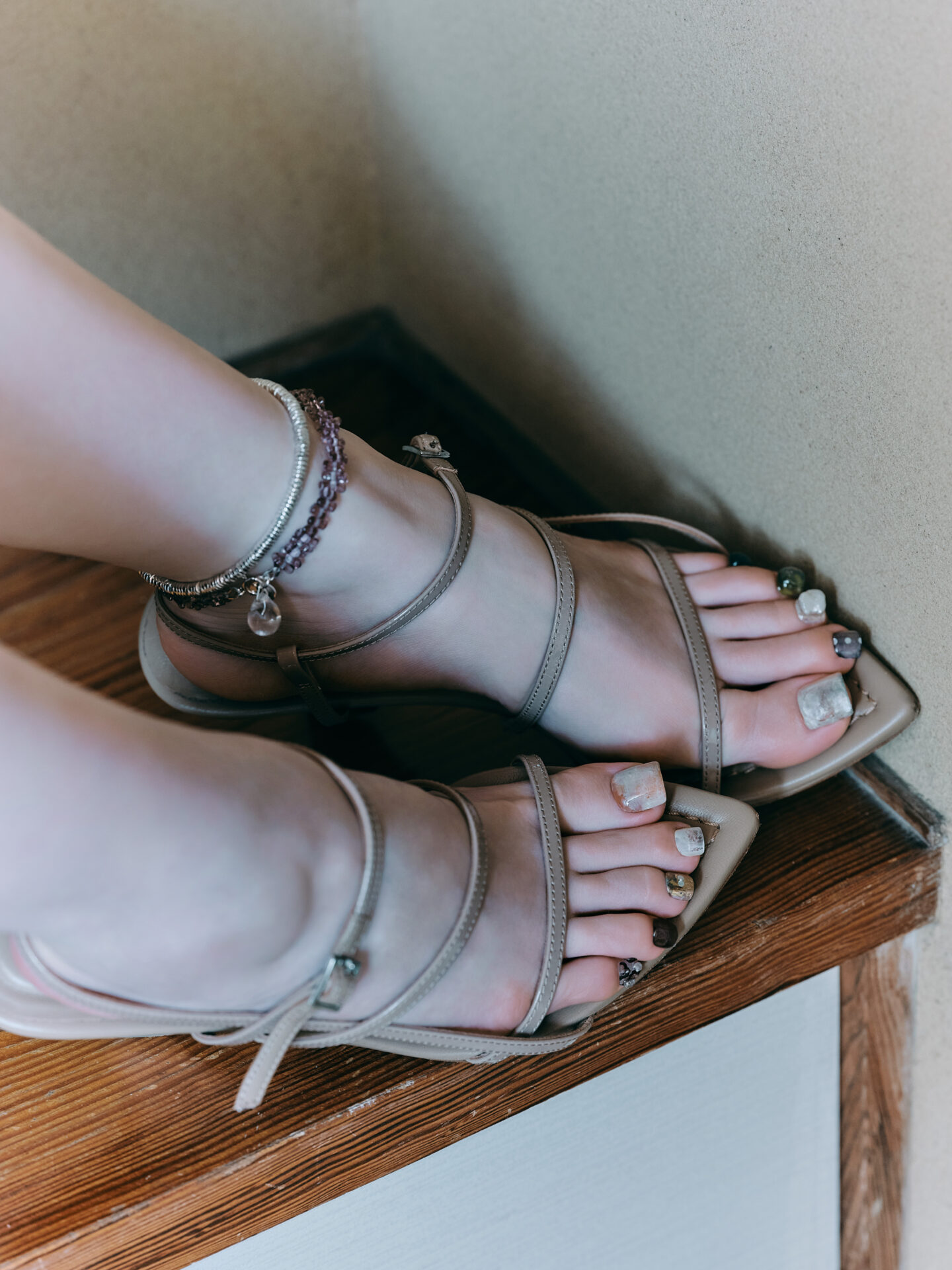
Kanako Ichikawa / nutt
By deliberately retaining rawness and irregularity, beauty within imperfection emerges. Contrasts of gloss and dimension are overlaid with silver metallics and fine shimmer, lending a modest radiance.
——「侘び寂び」から着想したイメージと、それをアートに落とし込む上で意識した点は?
静けさ、余白、経年変化、不完全の美しさ。華やかさではなく、控えめでどこか儚い美しさや、時間の流れを感じる質感をイメージしました。作り込みすぎず、あえてラフさや揺らぎを残すことで、不完全さの中にある美しさを表現しています。また、質感のコントラスト(ツヤ・立体)で静かな奥行きを出すようにこだわりました。
——What images did the theme “wabi-sabi” evoke for you, and what aspects were you mindful of when translating them into your art?
Stillness, negative space, the passage of time, and the beauty of imperfection. I imagined a subtle, almost ephemeral beauty rather than something flashy, with textures that convey the flow of time. By avoiding overworking the design and deliberately leaving some roughness and irregularity, I aimed to express the beauty found in imperfection. I also focused on creating a quiet sense of depth through contrasting textures—glossy versus dimensional surfaces.
——使用した主な素材・質感・カラー選びのポイントや、一方で「あえて加えなかった」要素はありますか?
シルバーのメタリックジェルや繊細なラメを取り入れ、控えめでありながら奥行きを感じる輝きを意識しています。一方で、強いラメや過度な装飾はあえて加えていません。侘び寂びの持つ「静けさ」や「余白」を大切にし、引き算の美しさを意識しました。主張しすぎないことで、質感やニュアンスそのものが際立つようにしています。
——What were the key materials, textures, and colour choices you focused on, as well as any elements you deliberately chose not to include?
I incorporated silver metallic gels and delicate glitter to create a subtle yet layered sense of shine. At the same time, I deliberately avoided strong glitter or excessive embellishments. Valuing the “stillness” and “negative space” inherent in wabi-sabi, I focused on the beauty of subtraction, allowing the textures and nuances themselves to stand out without being overpowered.
——フットネイルという特性を踏まえて意識した点は?
フットは上から見下ろす視点が多いため、どの角度から見てもバランスよく見える配置を意識しました。また、親指にポイントを置きつつ、他の指には抜け感を持たせることで、全体の調和を図っています。立体的なデザインも、重たく見えないようサイズや配置にこだわりました。
——What considerations did you make, given the nature of foot nail design?
As foot nails are often viewed from above, I considered how the design would look balanced from any angle. I placed emphasis on the big toe while keeping the other nails more understated, creating an overall sense of harmony. Even with dimensional elements, I paid close attention to scale and placement so the design wouldn’t feel too heavy.
aki / akinails
Metallic tones and foil reminiscent of terracotta and ceramics are brought together. A material-led approach, guided by an aesthetic that speaks without words.
——「侘び寂び」から着想したイメージと、それをアートに落とし込む上で意識した点は?
日本人特有の感覚にある、美しさや奥ゆかしさ。侘び寂びという言葉を用いずとも、その感覚を自然と感じ取っていただけるような表現を意識しました。
——What images did the theme “wabi-sabi” evoke for you, and what aspects were you mindful of when translating them into your art?
A sense of beauty and subtle elegance unique to Japanese culture. I aimed for an expression that conveys this feeling naturally, without explicitly using the term “wabi-sabi.”
——使用した主な素材・質感・カラー選びのポイントや、一方で「あえて加えなかった」要素はありますか?
テラコッタ素材や陶器のようなメタリックカラー、箔など、質感を重視できる商材を細部まで選び抜いて使用しています。キラキラとしたラメはあえて使用していません。安易に輝きを加えるのではなく、古き良き時代に宿る、答えのない光や不自由さを表現したかったためです。
——What were the key materials, textures, and colour choices you focused on, as well as any elements you deliberately chose not to include?
I carefully selected materials that emphasise texture, such as terracotta-like finishes, ceramic-inspired metallic colours, and foils. I deliberately avoided using sparkling glitter, as I wanted to express a subtle, timeless light and a sense of imperfection reminiscent of bygone eras, rather than adding shine in an obvious or superficial way.
——フットネイルという特性を踏まえて意識した点は?
幅のある親指には、あえて丸みを帯びた錯覚を生むアートを施し、やわらかな印象に仕上げています。
——What considerations did you make, given the nature of foot nail design?
For the wider big toe, I incorporated an art technique that creates a subtle illusion of roundness, resulting in a softer overall impression.
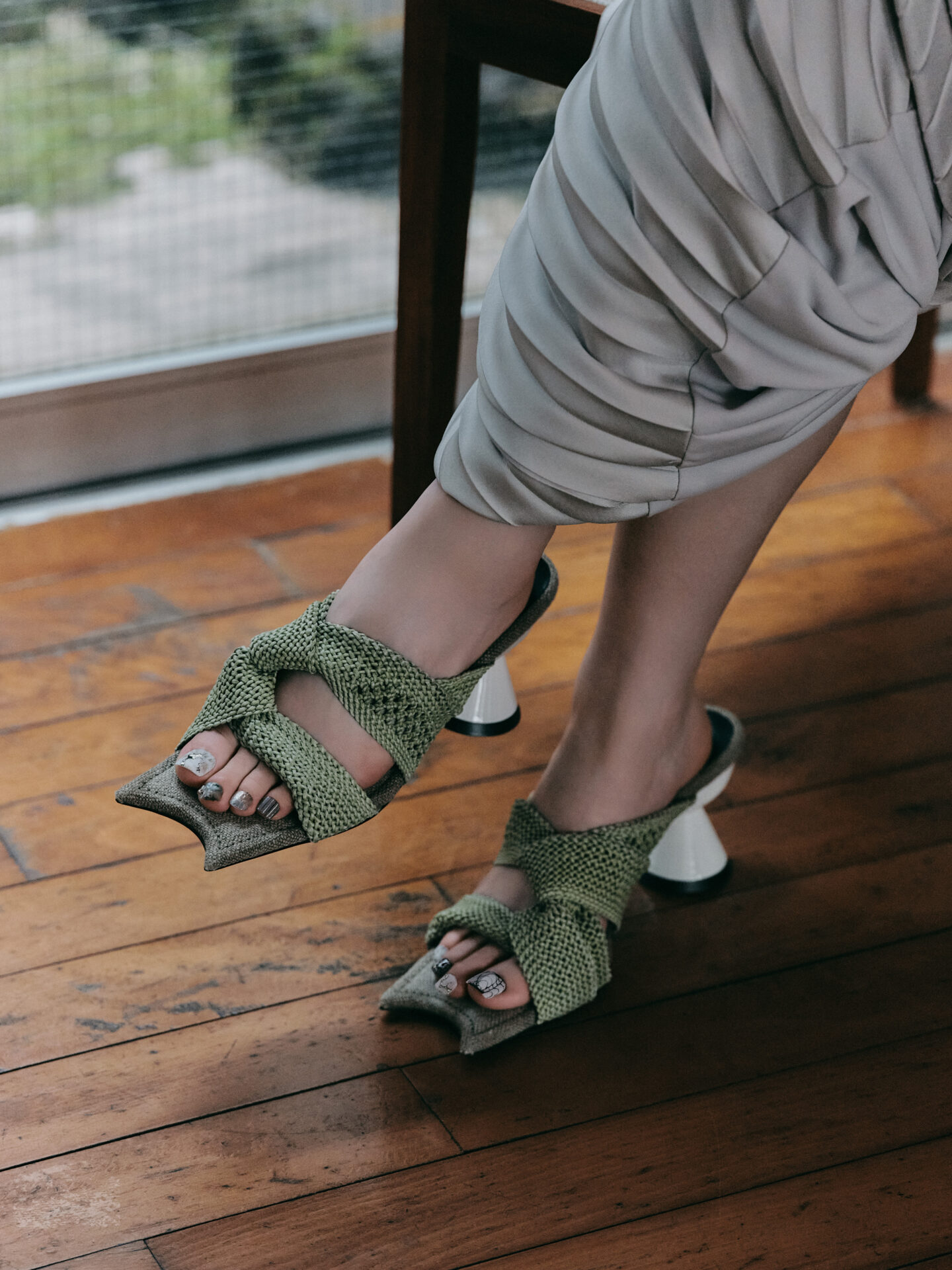
yuriko usui / NAIL CR
Framed by negative space and delicacy. Ceramic-like materials, layered colours, and gold recalling kintsugi compose a quiet presence with depth.
——「侘び寂び」から着想したイメージと、それをアートに落とし込む上で意識した点は?
「和」というイメージ。空白の大切さと、繊細さを意識しました。余白を活かすことで、静かな美しさが伝わるようにしています。
——What images did the theme “wabi-sabi” evoke for you, and what aspects were you mindful of when translating them into your art?
An image inspired by “Wa” (Japanese aesthetics). I focused on the importance of negative space and delicacy, using the emptiness to convey a quiet, understated beauty.
——使用した主な素材・質感・カラー選びのポイントや、一方で「あえて加えなかった」要素はありますか?
陶器を思わせる質感のジェルや、色の重なりによる奥行きを大切にしつつ、金継ぎをイメージしたゴールドを取り入れています。一方で、素朴さや不完全さを表現するため、描き込みすぎたり、色を多く使いすぎたりすることは控えました。
ーーWhat were the key materials, textures, and colour choices you focused on, as well as any elements you deliberately chose not to include?
I used gels with a ceramic-like texture and layered colours to create depth, incorporating gold inspired by the art of kintsugi. At the same time, to preserve a sense of simplicity and imperfection, I avoided overworking the design or using too many colours.
——フットネイルという特性を踏まえて意識した点は?
質素な中にもフットらしい存在感を持たせるため、左右であえて色味に差をつけ、メリハリを出しています。
——What considerations did you make, given the nature of foot nail design?
To give the design a subtle yet distinctive presence suited to foot nails, I intentionally varied the colour tones between the left and right to create contrast and balance.

satoko / Su___
A harmony of subdued Japanese sensibility within a multi-coloured palette, and a subtle dynamism within intricacy. Layered textures of gel lend depth even to a seemingly flat surface.
——「侘び寂び」から着想したイメージと、それをアートに落とし込む上で意識した点は?
落ち着いたトーンの中に、しっかりと芯があるイメージ。最近立ち上げたネイルスクール「neson」のコンセプトにも通じるものがあり、とても共感するテーマだと感じました。多色を取り入れつつも、和の落ち着きを感じられるバランスを意識しました。繊細さの中に、あえてダイナミックな要素を加えることで、奥行きのある表現にしています。
——What images did the theme “wabi-sabi” evoke for you, and what aspects were you mindful of when translating them into your art?
An image with a calm tone, yet a strong core. It resonates with the concept of my recently launched nail school, “neson,” making it a theme I deeply relate to. While incorporating multiple colours, I aimed for a balance that still conveys the calmness of Japanese aesthetics. By adding deliberately dynamic elements within the delicate design, I created a sense of depth and dimension.
ーー使用した主な素材・質感・カラー選びのポイントや、一方で「あえて加えなかった」要素はありますか?
さまざまなテクスチャーのジェルを使用し、平面的なアートの中にも奥行きを感じられるよう意識しました。均等に配置したパーツと、存在感のある淡水パールとのコントラストも、侘び寂びの一つの表現として取り入れています。全部を100%綺麗に! 全てを複雑なアートに! する訳ではなく、あえてシンプルに仕上げるところや歪なフォルムを取り入れることで抜け感をつくり、複雑なアートがより際立つようにしています。
——What were the key materials, textures, and colour choices you focused on, as well as any elements you deliberately chose not to include?
I used gels with various textures to create a sense of depth even within a predominantly flat design. The contrast between evenly placed elements and the prominent freshwater pearls is incorporated as one way to express wabi-sabi. Rather than making everything perfectly neat or overly intricate, I intentionally kept certain parts simple and included irregular shapes to create a sense of openness, which in turn makes the more complex elements stand out.
——フットネイルという特性を踏まえて意識した点は?
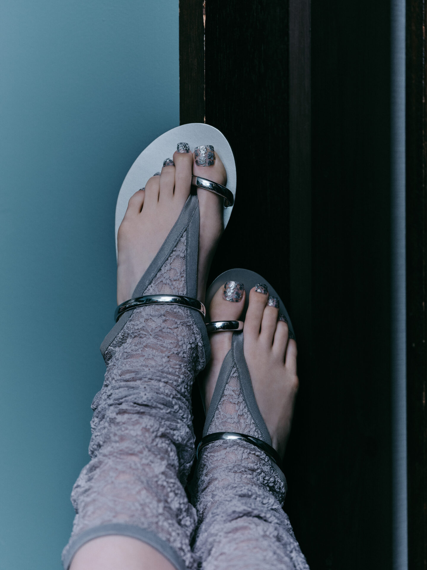
フットは丸みのあるフォルムが特徴的なため、パール自体がツメの一部に見えるようにしてみたり、親指はキャンバスが広いのでより絵画っぽくしてみました。実際にはこんな大きなパーツをフットにのせることはなかなか無いのですが…(笑)
——What considerations did you make, given the nature of foot nail design?
As foot nails tend to have a naturally rounded shape, I designed the pearls to almost appear as part of the nail itself. For the big toe, with its larger surface, I approached it more like a canvas, giving it a painterly feel. In reality, using such large elements on foot nails is quite unusual… but I embraced that playfulness. (laughs)
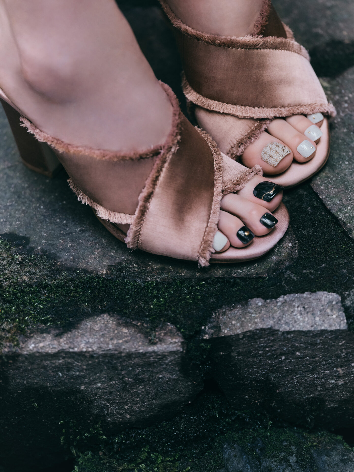
KONOMI / atelier Limorphodon
The contrast between the continuous flow of water and a stillness that holds time in place. Intentional variations in texture and movement reflect the multiplicity inherent in wabi-sabi, expressed through an asymmetrical design.
——「侘び寂び」から着想したイメージと、それをアートに落とし込む上で意識した点は?
不完全さや経年変化に宿る美しさ、静けさの中の奥行き、余白や揺らぎを意識しました。水の波紋のように広がる変化や、金継ぎのように壊れたものを美しく繋ぐイメージから、「変化を受け入れ、味わいとして昇華する美」を表現。凹凸や流れに個体差を持たせ、光や角度によって表情が変わるようにしています。水の流れの動きと金継ぎを思わせる静けさの対比で、侘び寂びの奥行きを描きました。
——What images did the theme “wabi-sabi” evoke for you, and what aspects were you mindful of when translating them into your art?
I focused on the beauty found in imperfection and the passage of time, the depth within stillness, and the play of space and subtle variations. Inspired by the way ripples spread across water and how broken pieces are beautifully joined in kintsugi, I aimed to express a beauty that embraces change and transforms it into character. I incorporated variations in texture and flow so that the appearance shifts depending on the light and viewing angle. By contrasting the movement reminiscent of flowing water with the quietness evoked by kintsugi, I conveyed the depth of wabi-sabi.
——使用した主な素材・質感・カラー選びのポイントや、一方で「あえて加えなかった」要素はありますか?
一方は新緑をイメージしたカラーに、水面のようなみずみずしい質感を重ねています。もう一方は落ち着いた色味をベースに、水彩のオーロララメを滲ませることで、柔らかく曖昧なニュアンスを表現しました。また、マットとツヤを組み合わせることで、経年変化や質感の差異を感じられる奥行きを意識しています。過度な装飾や大きなパーツはあえて使用していません。侘び寂びの「静けさ」や「余白」を大切にし、シンプルな中で質感やニュアンスを感じられる表現を目指しました。
——What were the key materials, textures, and colour choices you focused on, as well as any elements you deliberately chose not to include?
On one hand, I layered a colour inspired by fresh spring greenery with a dewy, water-like texture. On the other, I used a calm, muted base and applied a wash of watercolor-like aurora glitter to create soft, subtle nuances. By combining matte and glossy finishes, I aimed to convey depth that evokes the passage of time and variations in texture. I deliberately avoided excessive decoration or large embellishments, focusing instead on the wabi-sabi concepts of “quietness” and “space,” and creating a design where texture and nuance can be appreciated within simplicity.
——フットネイルという特性を踏まえて意識した点は?
フットは角度によって見え方が変わるため、どの角度から見ても立体感や奥行きが伝わるように構成しています。また、限られた面積の中でも印象が際立つよう、質感のコントラストをやや強めに出しています。
——What considerations did you make, given the nature of foot nail design?
As foot nails can appear differently depending on the angle, I composed the design so that its dimensionality and depth can be appreciated from any viewpoint. I also emphasised contrast in texture slightly more than usual, so that the overall impression remains striking even within a limited surface area.
PHOTOGRAPHER: HINATO NISHITANI
STYLIST: MIKAKO SHINOHARA
EDITOR: MAKO UCHIDA
こちらの情報は『NAILEX 2026年6月号』に掲載された内容を再編集したものです。