足元に宿る「侘び寂び」の表現 vol.1|SHAPE OF WABI-SABI
2026.04.23
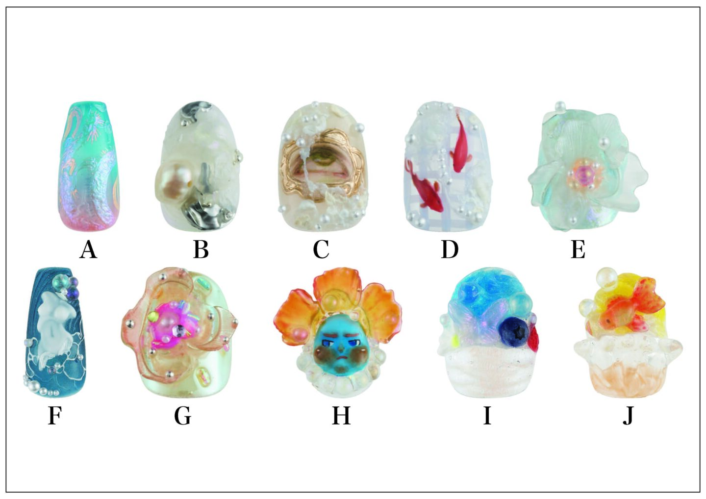
儚さを、未完成さを、「美しい」と思う心を私たちは確かに持っている。10名のネイリストが、日本古来の美意識をフットの世界に投影。それぞれの感性と響き合いながら、静かな存在感を放つアートに注目。WEBページでは、作品に込めた想いや、フットネイルならではの視点についてインタビュー。
We undeniably possess a sensibility that finds beauty in transience and imperfection. Ten nail artists interpret traditional Japanese aesthetics through the world of foot design. Resonating with each of their individual sensibilities, the resulting artworks command a quiet yet striking presence. On this page, we feature an interview exploring the thoughts behind the work, as well as perspectives unique to foot nail design.
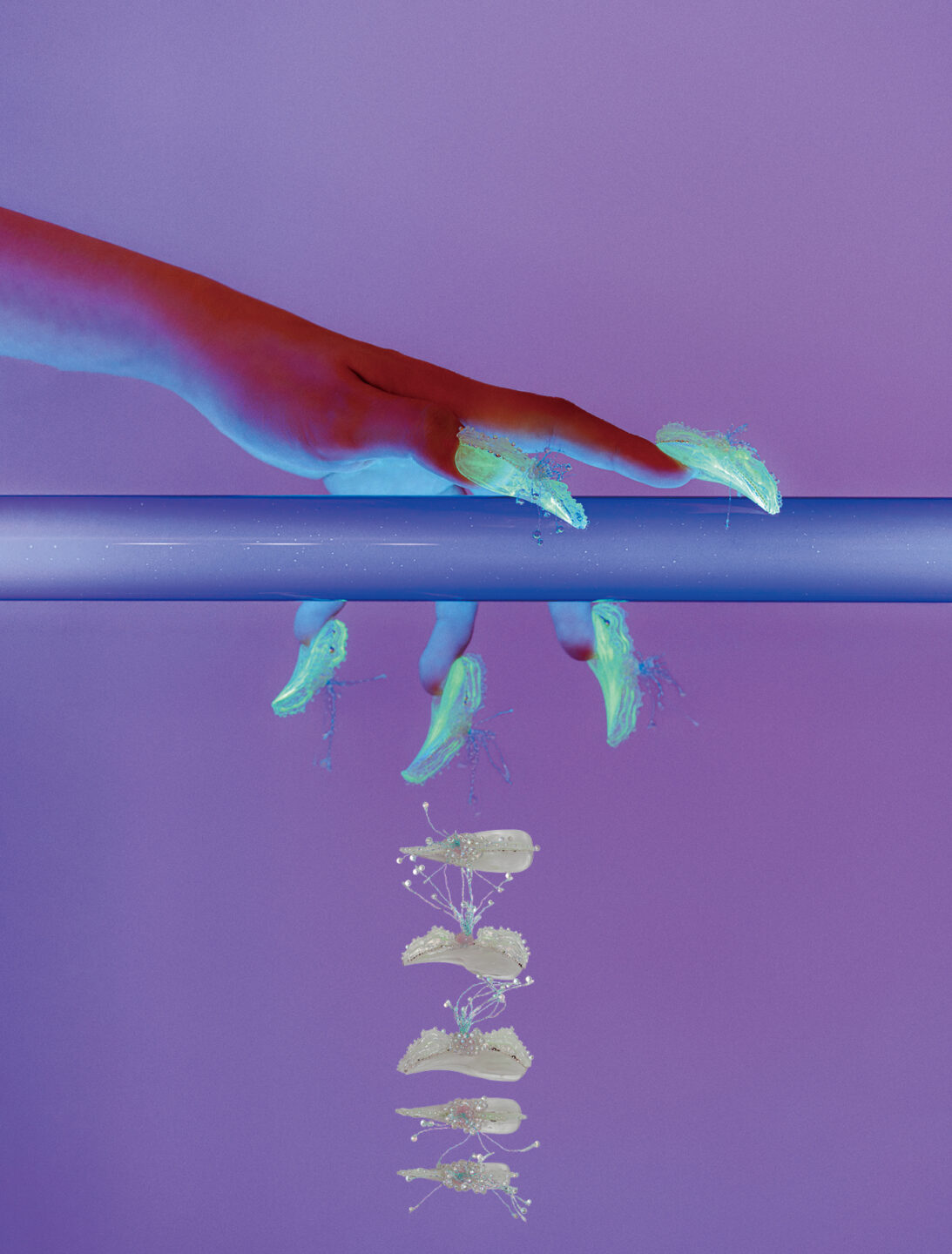
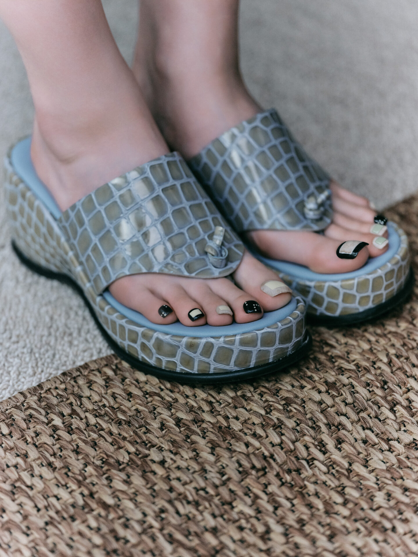
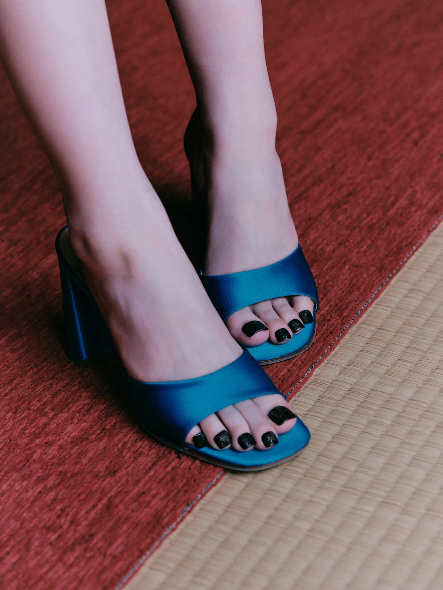
5107 / NOVAN atelier
Layers of soft-toned gel are built up, then carved back to reveal depth and negative space. Minimal motifs reminiscent of karesansui, where traces of time gently seep through.
——「侘び寂び」から着想したイメージと、それをアートに落とし込む上で意識した点は?
無駄を削ぎ落とした先にある、日本特有の美的感覚。静けさの中にどこかもの寂しさを感じさせつつも、隙のないイメージです。侘び寂びの美意識と枯山水をイメージしました。時間の経過によって生まれる奥行きのある質感や余白を取り入れ、枯山水のような静かな美を表現しています。
——What images did the theme “wabi-sabi” evoke for you, and what aspects were you mindful of when translating them into your art?
A distinctly Japanese aesthetic that emerges once all excess has been stripped away. It conveys a sense of quietude, tinged with a subtle melancholy, while remaining impeccably composed. I drew inspiration from the sensibility of wabi-sabi and the imagery of karesansui. By incorporating depth and negative space shaped through the passage of time, I sought to express a quiet, contemplative beauty reminiscent of a dry landscape garden.
——使用した主な素材・質感・カラー選びのポイントや、一方で「あえて加えなかった」要素はありますか?
ジェルを重ねて塗布し、一度削ることでアートを仕上げています。日本の伝統色を思わせる、彩度を抑えた色味を意識しました。侘び寂びの持つマットで重厚な質感を表現するため、ラメや光沢の強い装飾はあえて加えていません。
——What were the key materials, textures, and colour choices you focused on, as well as any elements you deliberately chose not to include?
The design was built up through layered applications of gel, then refined by carving back into the surface. I focused on subdued tones reminiscent of traditional Japanese colours. To evoke the matte, weighty texture inherent in wabi-sabi, I deliberately avoided adding glitter or high-shine embellishments.
——フットネイルという特性を踏まえて意識した点は?
フットは目線から距離があるため、遠くから見ても印象が伝わる色味で仕上げることを意識しています。
——What considerations did you make, given the nature of foot nail design?
As foot nails are typically seen from a bit of a distance, I focused on choosing colours that still convey a clear impression even when viewed from afar.
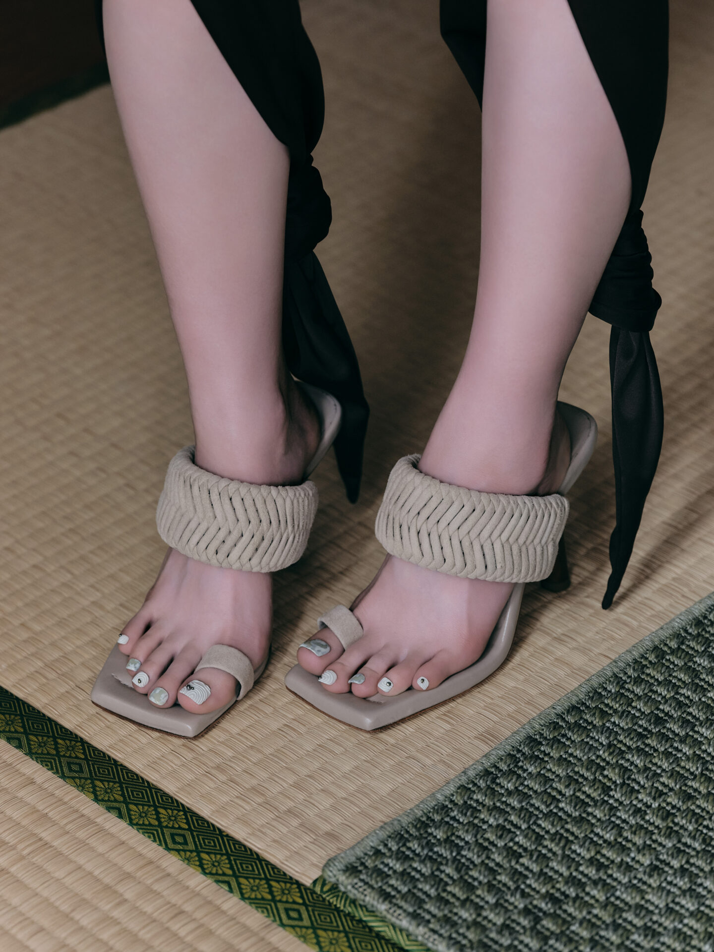
Asato / Mea
Texture gel and ink create a patina akin to an aged hanging scroll. Paired with light, spring–summer hues, a classical aesthetic is given a modern update.
——「侘び寂び」から着想したイメージと、それをアートに落とし込む上で意識した点は?
年月を感じさせる掛け軸。古びた紙面のような質感に、現代的なカラーをモダンに重ねることで表現しました。シンプルな中に侘び寂びを感じられるアートを意識しています。
——What images did the theme “wabi-sabi” evoke for you, and what aspects were you mindful of when translating them into your art?
I was inspired by the look of a hanging scroll that evokes the passage of time. I layered modern colours over textures reminiscent of aged paper, creating a piece that feels simple yet conveys the subtle beauty of wabi-sabi.
——使用した主な素材・質感・カラー選びのポイントや、一方で「あえて加えなかった」要素はありますか?
質感を出すテクスチャージェルにインクを重ね、一見相反するような春夏らしいカラーをあえて組み合わせています。シンプルな中に品を感じるような大人っぽい雰囲気に仕上げたかったため、凹凸のある素材やパーツはあえて使用していません。
——What were the key materials, textures, and colour choices you focused on, as well as any elements you deliberately chose not to include?
I layered ink over textured gels to bring out depth, and deliberately combined seemingly contrasting spring and summer colours. To achieve a refined, adult-like feel within a simple design, I avoided using materials or embellishments with pronounced bumps or raised elements.
——フットネイルという特性(爪の形・角度・見え方)を踏まえて意識した点はありますか?
スクエアのアートは存在感が出るよう、爪いっぱいに描くことを意識しています。
——What considerations did you make, given the nature of foot nail design?
For the square designs, I made a point of filling the entire nail so they feel bold and impactful.

Ayaka Koshi / UA STUDIO
Centred on an organic sensibility within stillness. Indescribable 3D forms and negative-space painting invite open-ended interpretations shaped by the viewer’s perception.
——「侘び寂び」から着想したイメージと、それをアートに落とし込む上で意識した点は?
枯山水庭園。静けさの中にある有機性をテーマに、見る人によって解釈が変わるような表現を意識しました。形容しきれないフォルムや余白を活かしたペイントと、3Dをメインに構成しています。
——What images did the theme “wabi-sabi” evoke for you, and what aspects were you mindful of when translating them into your art?
A karesansui (dry landscape garden). I focused on the organic qualities found within stillness, aiming for an expression that can be interpreted differently by each viewer. The design features painting that emphasises indescribable forms and negative space, with 3D elements as the main focus.
——使用した主な素材・質感・カラー選びのポイントや、一方で「あえて加えなかった」要素はありますか?
“和”を直接想起させない色味やテクスチャーを選ぶことで、イメージを限定しないよう意識しています。一方で、砂や滲みを連想させるアートや商材は使用していません。イメージと直結する表現は、見る人の解釈の幅を狭めてしまうと考えたためです。
——What were the key materials, textures, and colour choices you focused on, as well as any elements you deliberately chose not to include?
I deliberately chose colours and textures that don’t directly evoke “Japanese-ness,” so as not to limit the interpretation of the design. At the same time, I avoided using materials or techniques that suggest sand or bleeding effects, as I felt that overly literal references might narrow the viewer’s personal interpretation.
——フットネイルという特性を踏まえて意識した点は?
フットはハンドと異なり、10本を俯瞰で捉えられるため、アートが並ぶ“陳列”のような見え方を意識しました。そのため、すべての指を主役として制作しています。
——What considerations did you make, given the nature of foot nail design?
Unlike hand nails, foot nails are often seen all ten at once from above, so I considered how they would appear almost like a “display” when arranged together. For that reason, I approached each nail as a focal point in its own right.
misato aoyama / Cerejeira
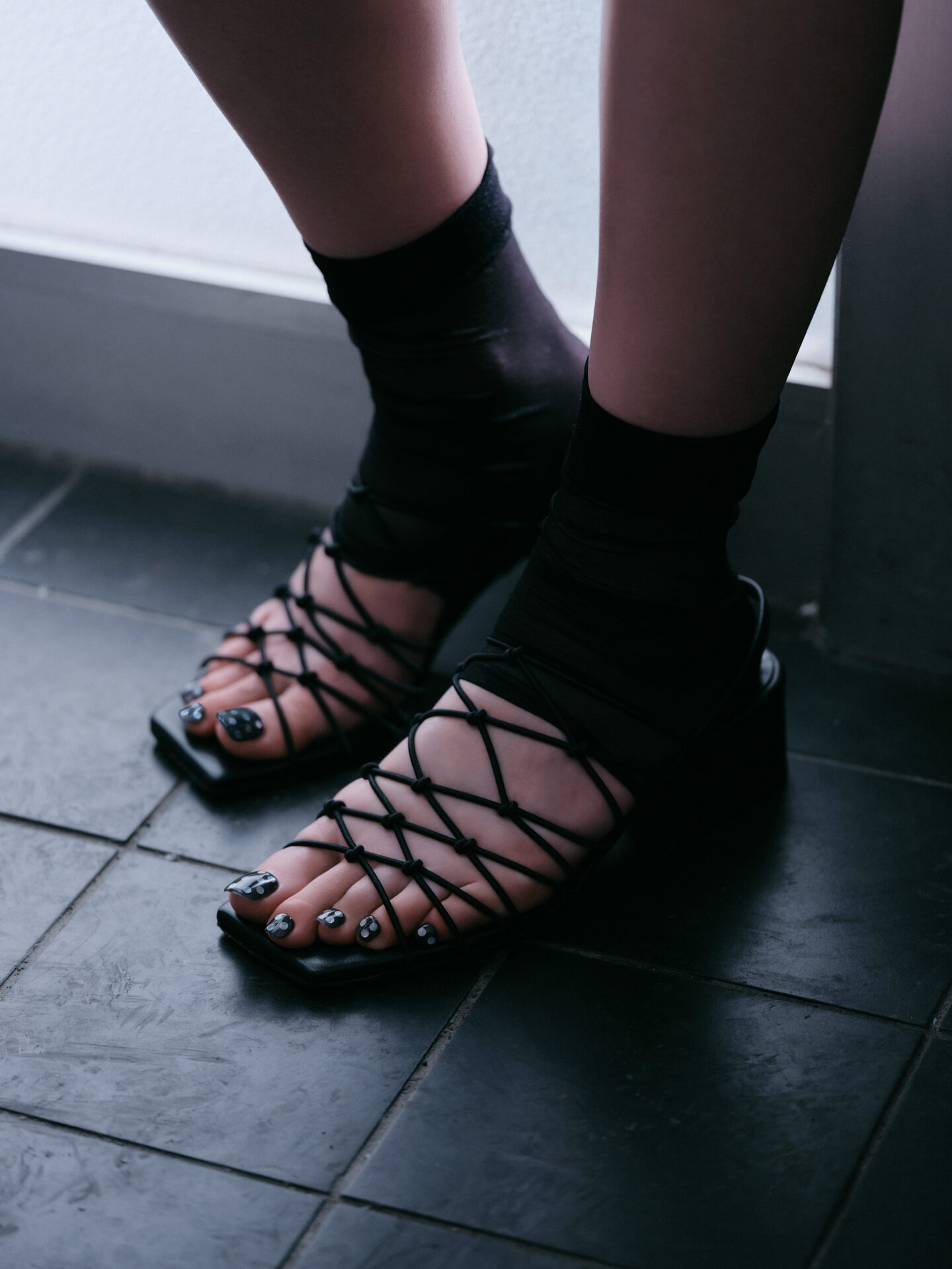
A reinterpretation of the classic dot in a refined palette. Sheer black layered with delicately iridescent hologram, shifting in expression as the light changes.
——「侘び寂び」から着想したイメージと、それをアートに落とし込む上で意識した点は?
和モダン。トレンドのドットを、カジュアルになりすぎないよう落とし込むことを意識しました。
——What images did the theme “wabi-sabi” evoke for you, and what aspects were you mindful of when translating them into your art?
A “Wa-Modern” concept. I incorporated trendy dots while being careful not to make the design feel too casual.
——使用した主な素材・質感・カラー選びのポイントや、一方で「あえて加えなかった」要素はありますか?
透け感のあるブラックをベースに、レインボーに光るホログラムを組み合わせています。異なるデザインを加えず、あえて統一することで落ち着いた雰囲気に仕上げています。
——What were the key materials, textures, and colour choices you focused on, as well as any elements you deliberately chose not to include?
I used a translucent black as the base and combined it with holographic elements that shimmer in rainbow colours. I deliberately avoided adding different designs, keeping the look unified to create a calm, balanced atmosphere.
——フットネイルという特性を踏まえて意識した点は?
ドットの配置はあえて均一にせず、ランダムにすることで抜け感とリズムを出しています。
——What considerations did you make, given the nature of foot nail design?
I intentionally kept the dot placement irregular rather than uniform, creating a sense of rhythm and an effortless, relaxed feel.

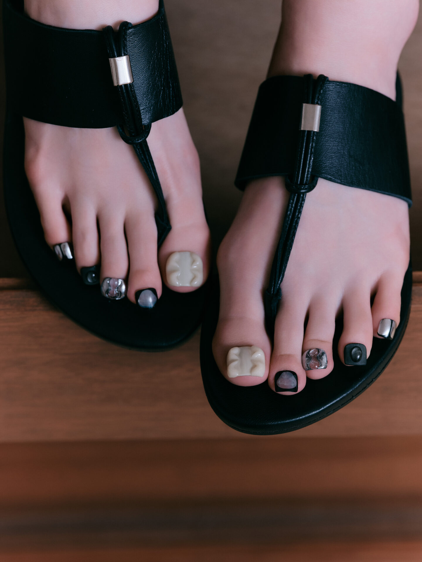
miho / higden
Matte black layered with finely shimmering brown and foil. A naturally weathered nuance evokes the beauty of ageing and the quiet mystique held within the old.
——「侘び寂び」から着想したイメージと、それをアートに落とし込む上で意識した点は?
不完全さや経年による美しさ、古さの中に宿る神秘性。作り込みすぎず、“綺麗なもの”をあえて作らないことを意識しました。偶然生まれた質感をそのまま残し、その瞬間にしか出せない表情を大切にしています。
——What images did the theme “wabi-sabi” evoke for you, and what aspects were you mindful of when translating them into your art?
The beauty of imperfection and the passage of time, and the sense of mystery found within aged materials. I focused on avoiding overworked perfection, deliberately leaving things “imperfect.” I preserved textures that emerged by chance, valuing the unique expressions that can only appear in that moment.
——使用した主な素材・質感・カラー選びのポイントや、一方で「あえて加えなかった」要素はありますか?
マットなブラックをベースに、わずかに光を感じるブラウンや箔を重ねることで奥行きを出し、劣化によって錆びたような自然の質感を意識しました。華やかさが強く出すぎてしまうのを避け、質感そのものを活かしたデザインにしたかったため、ラメや明るいカラー、ストーンなどの装飾は加えていません。
——What were the key materials, textures, and colour choices you focused on, as well as any elements you deliberately chose not to include?
I used a matte black base and layered subtle brown tones and metallic foils to create depth, evoking the natural, weathered textures of aged materials. To avoid making the design overly flashy and to let the textures themselves stand out, I deliberately did not include glitter, bright colours, or stones.
——フットネイルという特性を踏まえて意識した点は?
親指に視線が集まるので、質感の重なりや深みを一番強く出しています。また足元は自分の視点から距離があるため、パッと見たときに存在感がありつつも、日常でのバランスも考え、ボリュームが出すぎないように意識しました。
——What considerations did you make, given the nature of foot nail design?
As the big toe naturally draws the eye, I emphasised depth and layered texture there most strongly. At the same time, since foot nails are viewed from a distance in everyday life, I aimed for a balance—ensuring it has presence at a glance without becoming too heavy or overpowering.
PHOTOGRAPHER: HINATO NISHITANI
STYLIST: MIKAKO SHINOHARA
EDITOR: MAKO UCHIDA
こちらの情報は『NAILEX 2026年6月号』に掲載された内容を再編集したものです。